
Limelight
FP&A Software / Budgeting / Reporting / Forecasting / Dashboards / Task Manager
My role
Timeline
Team size
Link
Product
The B2B product is built for financial management and planning within companies. It offers budgeting, forecasting, and reporting tools, along with features for cross-department collaboration. Users can configure access levels and security settings, ensuring that financial data remains protected while enabling seamless teamwork.
USers
Our users are companies managing finances through budgeting, forecasting, and reporting. The platform ensures controlled access, allowing departments to edit only assigned cells, while managers oversee all data, ensuring security and efficiency.
Context
Before I joined, there was no designer on the product. I was brought in to identify key problems, propose improvements, and develop a structured action plan to enhance the user experience and overall design.
activities
- Heuristic evaluation
- Competitor analysis
- Employee survey
- Workshop "Service Blueprint"
- Persona Creation
- Effort impact matrix
- Prototype
- Usability testing
Problem
A high-level analysis of the product revealed numerous areas for improvement. However, a superficial review was insufficient, as deeper research was necessary to identify critical pain points. Limited resources made it essential to focus on impactful yet feasible changes.
Solution
I structured the research into three stages. First, I conducted a product analysis to identify quick wins using an effort-impact matrix. Then, I leveraged internal research by interviewing employees across departments and attending onboarding calls to uncover pain points. Finally, I prepared user research through surveys and usability testing to validate and refine new features.
Main Functional
Tables
The product involves a vast amount of data that needs to be filtered and sorted according to user needs. Therefore, using tables as the initial view proved to be the most optimal solution.

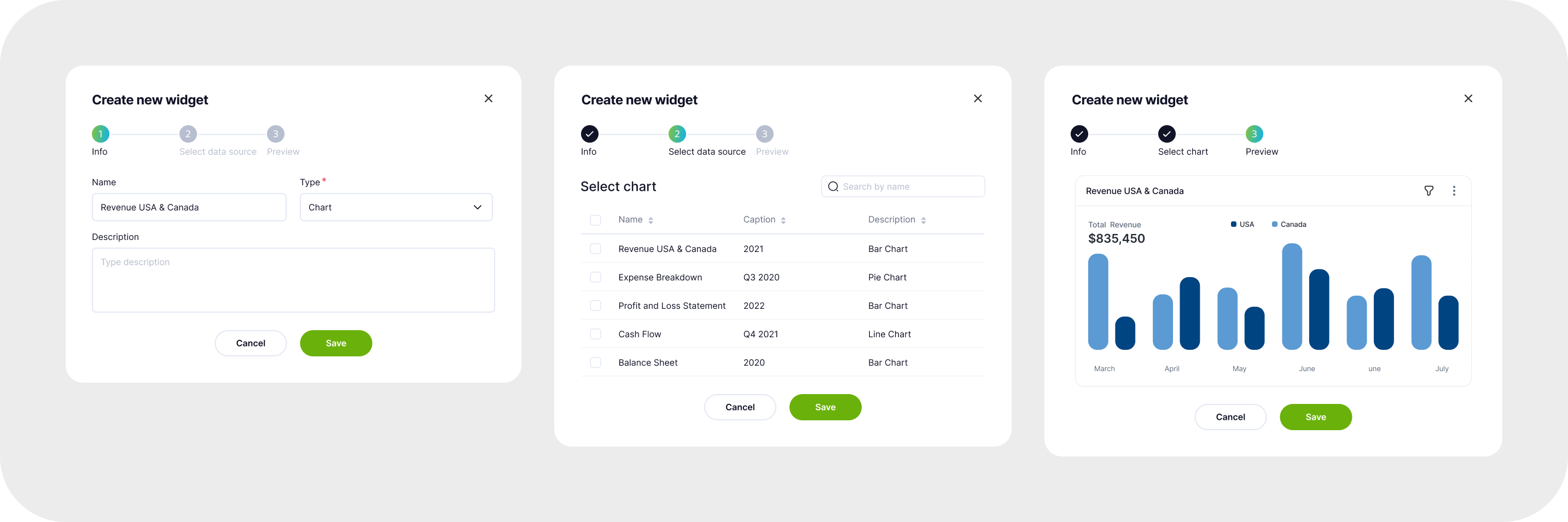
Analytical Dashboard
Dashboards allow users to add widgets and customize their content. These can include charts and graphs with filtering and scaling options, tables, images, and text. All widgets are linked to the main files and update automatically with any changes. Additionally, there is a PowerPoint plugin that enables users to embed charts in presentations, ensuring that the data stays up to date.

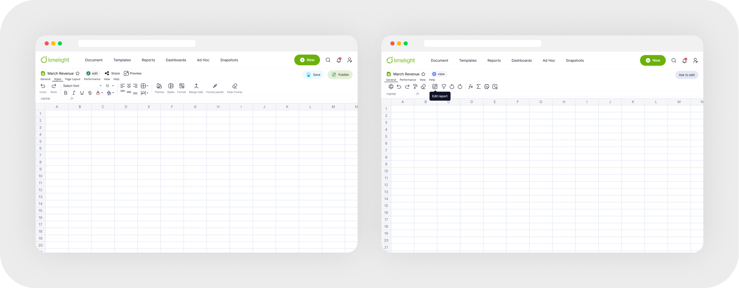
Reports & Templates
These are advanced tables with extensive functionality and complex calculations. Different access levels are available. For example, when opening a single file, department heads can input their figures without seeing data from other departments. Only the general manager has access to the complete overview.
Ad Hoc Report

Data Servers
In a fintech product refer to the infrastructure that stores and manages large volumes of financial data, ensuring fast access and secure storage.

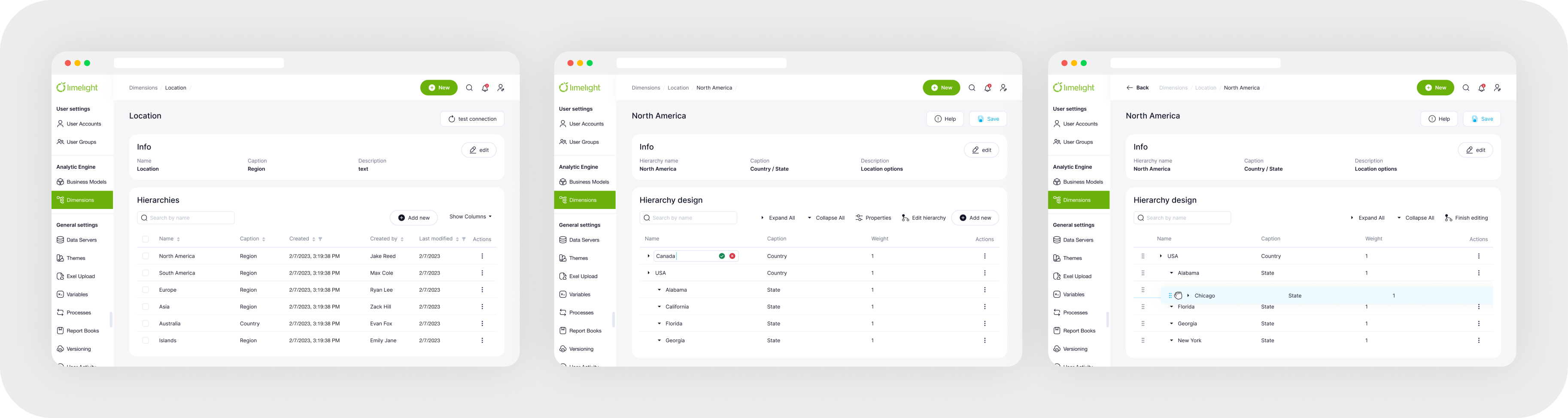
Dimensions
Specific attributes or categories used to slice and analyze data, such as time, region, or product type, enabling detailed insights and reporting in financial analysis.
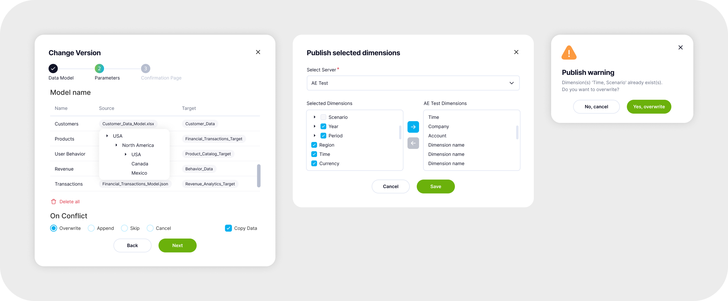
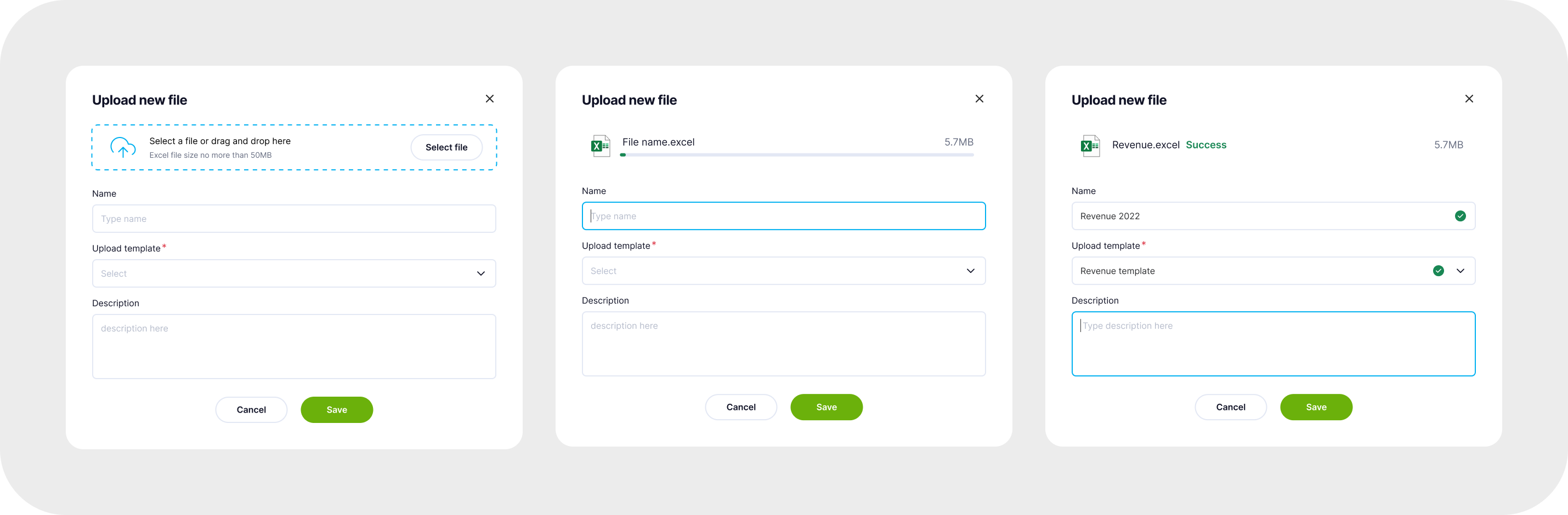
Upload Manager
The Upload Manager allows users to upload Excel files, documents, images, and other types of files seamlessly.
User & User Groups
Access settings for specific files, defining permissions for viewing or editing. A user can belong to multiple groups, allowing for faster and more efficient access configuration by grouping individuals based on their roles.

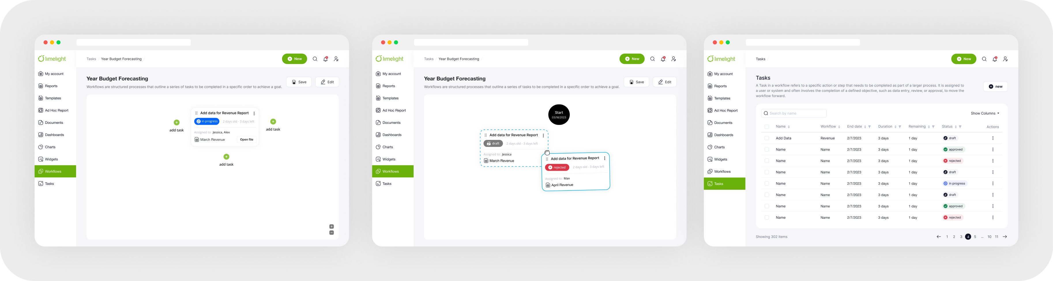
Workflows & Task
Workflows are structured processes that outline a series of tasks to be completed in a specific order to achieve a goal. A Task within a workflow refers to an individual action or step assigned to a user or system that contributes to progressing the workflow towards completion.
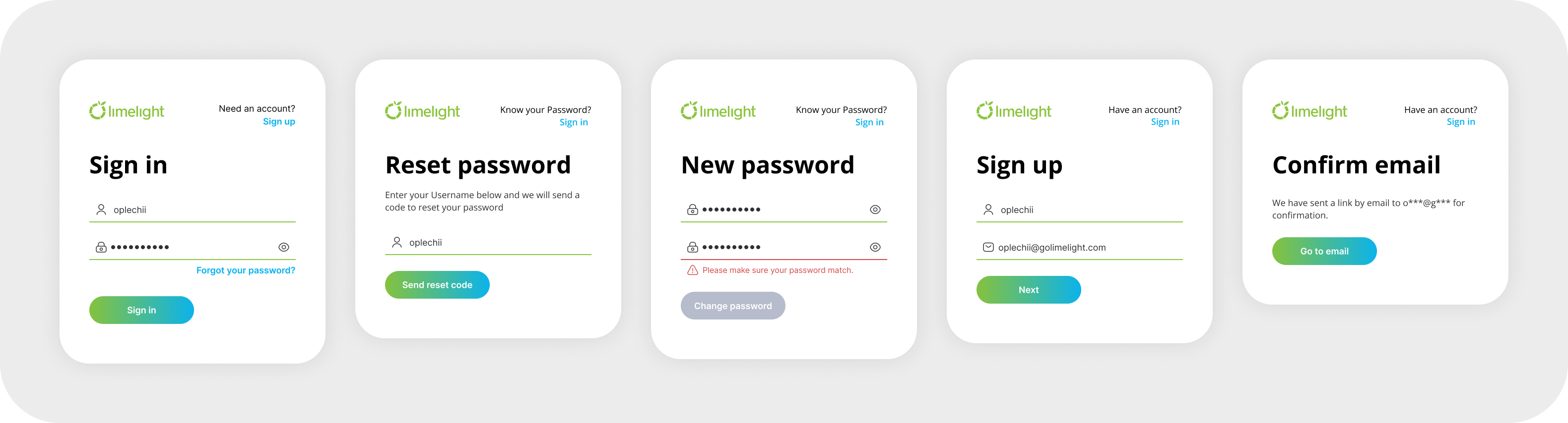
Sign in
Sign In is the process through which users authenticate their identity by providing credentials (username and password) to access a system.

Work Process
Main Heuristic Problems
Visibility of System Status
Lack of State Feedback: Interactive elements (e.g., inputs, buttons) lacked visual feedback, making it unclear if actions were registered.
Inconsistent Loading Indicators: Loaders and skeleton screens were inconsistently applied, leading to confusion about data loading states.
Blank Pages Without Guidance: Some pages lacked messaging or calls-to-action, making it unclear what to do next. Adding empty states would improve user guidance.
Help Users Recognize, Diagnose, and Recover from Errors
Generic Error Messages: Error messages were vague and did not provide actionable guidance for resolution.
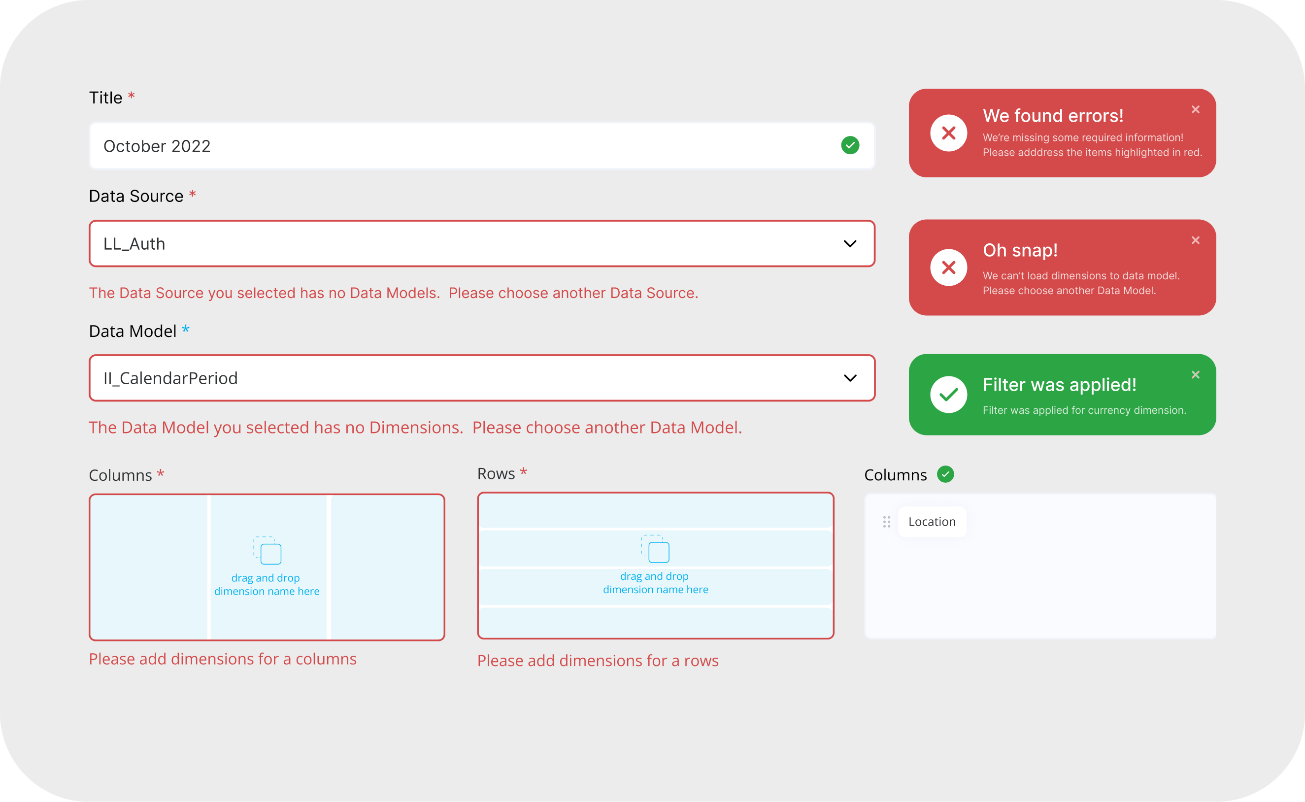
Lack of Validation Feedback: Required fields were not clearly marked, and no inline validation highlighted errors in real-time.
Error Prevention
Missing Tooltips and Hints: There were no contextual hints or tooltips to help users understand complex fields, increasing the risk of errors.
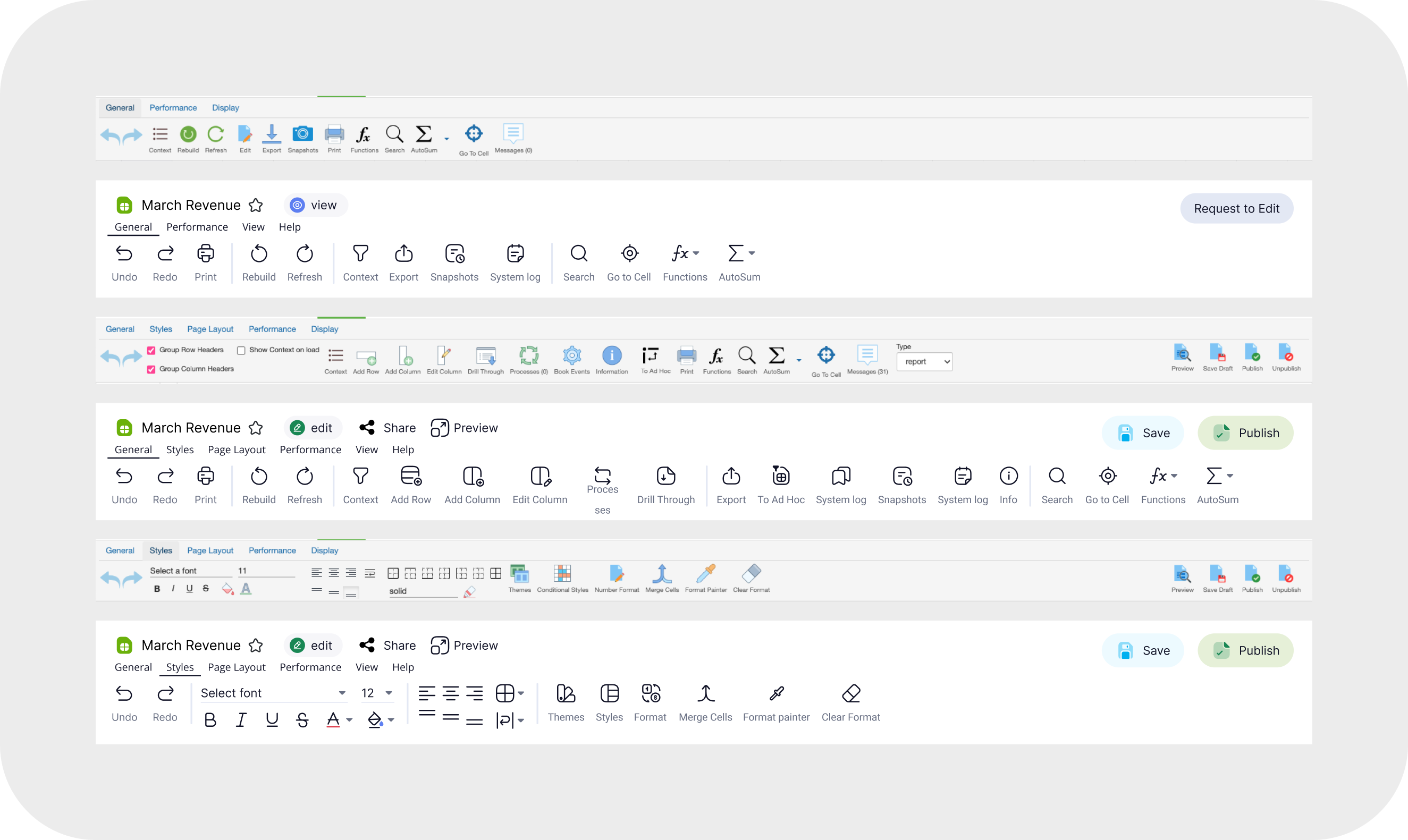
Consistency & Standards
Inconsistent UI Patterns: Variations in design elements and interaction patterns created a disjointed user experience.
Misalignment with Industry Standards: Since part of the product involves file creation, aligning the UI structure with familiar applications (e.g., Word, Excel, PowerPoint) would improve usability.
Inconsistency
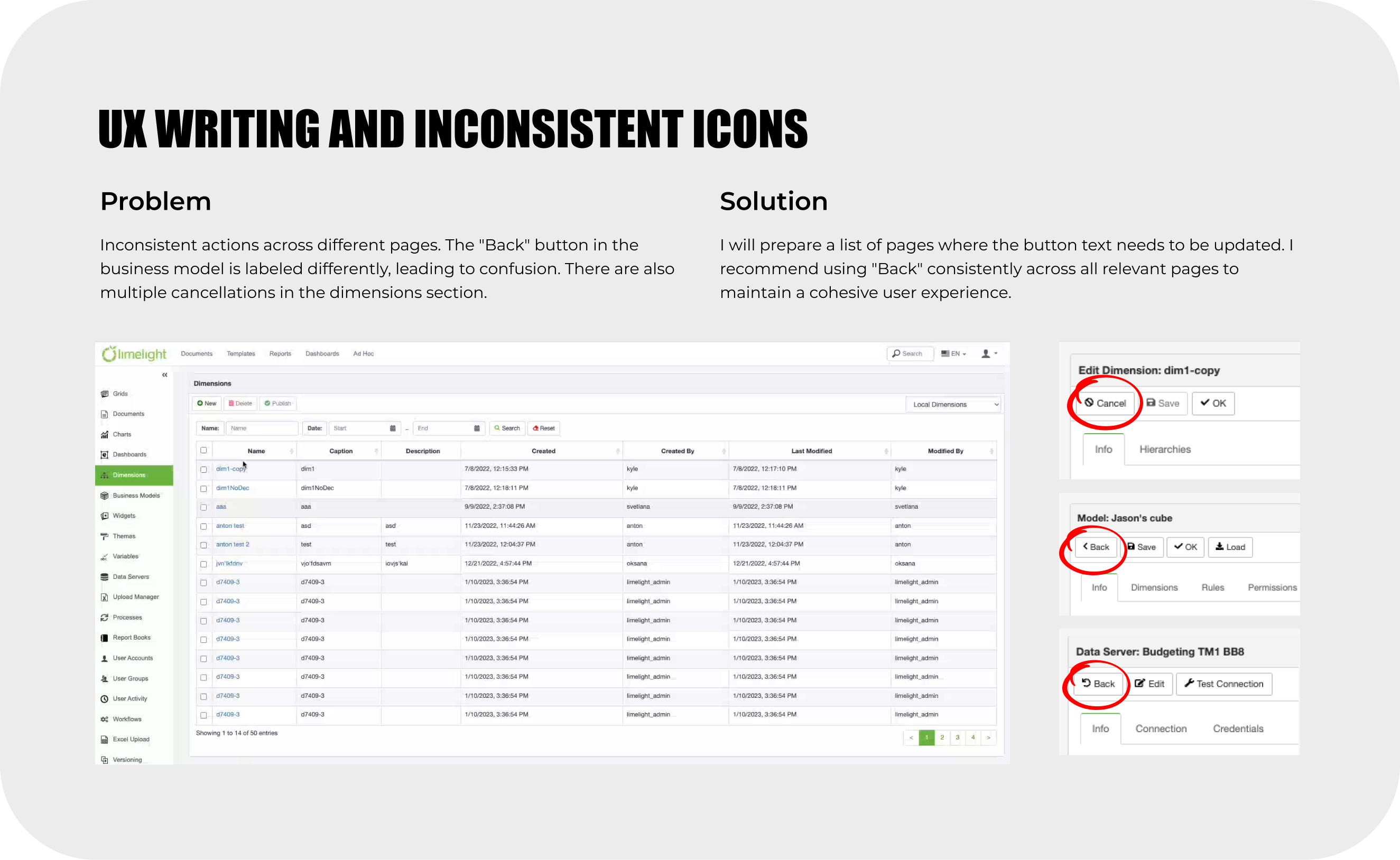
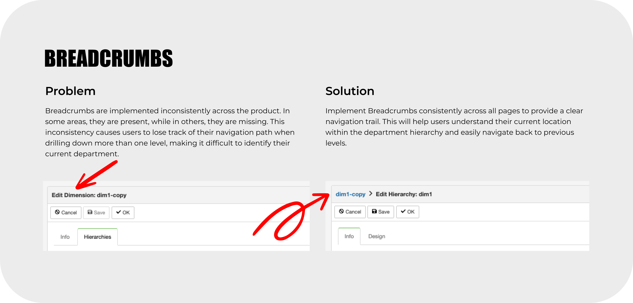
Problem
The primary issue was inconsistent design patterns. For example, breadcrumbs were present on some pages but absent on others, and the "Create" button triggered different actions (modal vs. new page). This inconsistency disrupted the user experience.
Solution
We created a Design System to standardize patterns, leveraging React Bootstrap as a foundation and customizing it for our branding.


Key Problems Addressed:
- Inconsistent Patterns and Sequences: Variations in modals and step sequences affected the user flow.
- UX Writing Inconsistencies: Action labels (e.g., "Back," "Cancel," "Next," "Continue") were inconsistent, leading to confusion.
- Inconsistent Icon Usage: The same icons were used for different functions.
- Multiple Loader Types: Four different loaders were used inconsistently.
- Inconsistent Color Usage: There was no clear color hierarchy, impacting the emphasis on actions.


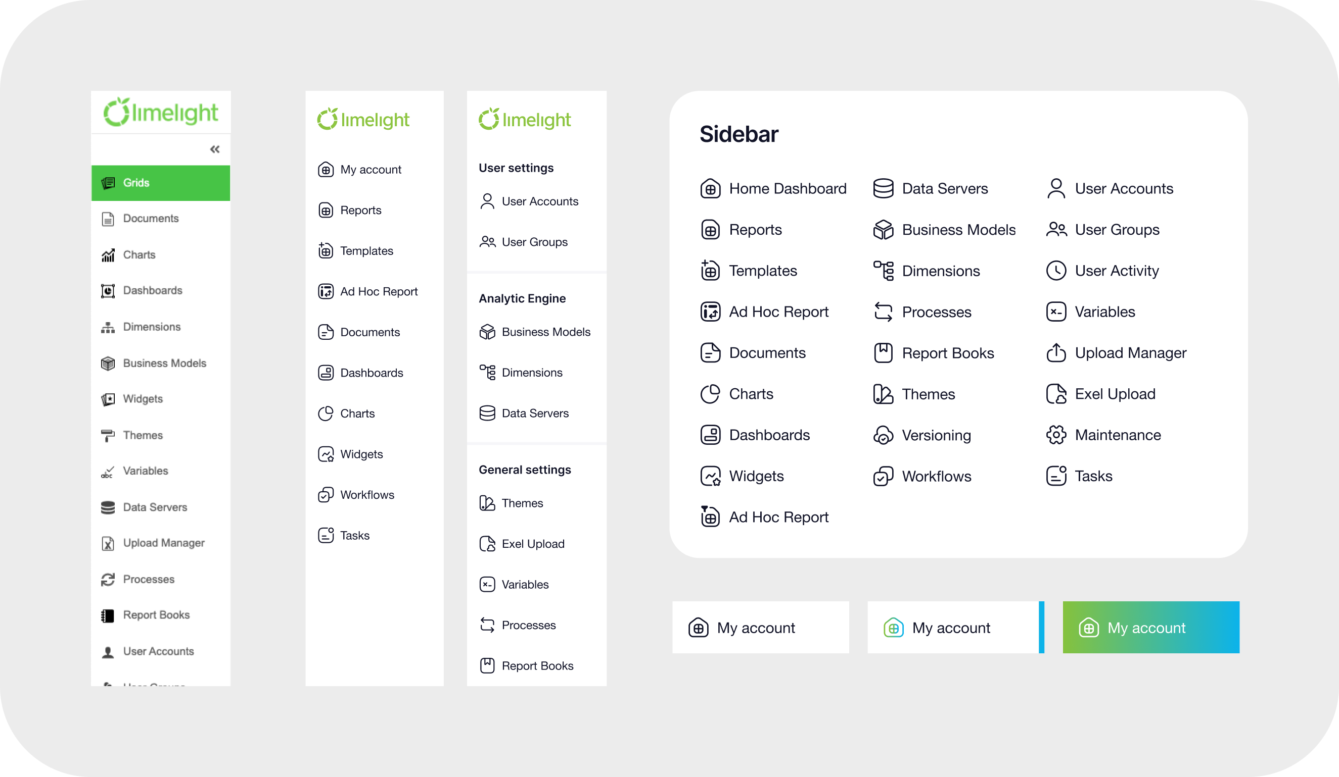
Product Hierarchy
Problem
Navigation relied on a lengthy, scrolling sidebar with no grouping, and some navigation elements were duplicated in the header.
Solution
Using analytics on user behavior, we reorganized the navigation into two sidebars: one for core features and another for account settings accessible via the profile icon.
Excel Users
Problem
Our primary users (accountants and managers) were familiar with Excel, but our product's interface differed, leading to usability challenges.
Solution
We restructured the table interactions to be more intuitive and highlighted unique product advantages to ease the transition from Excel.
Custom Dashboards
Problem
Users utilized dashboards differently (e.g., as start pages, for KPIs, presentations) or avoided them due to an unclear starting point.
Solution
We improved the dashboard creation flow, updated theme settings, introduced a modular grid template, and provided example templates to enhance usability and engagement.
Ad Hoc Reports
Problem
Creating custom report templates for each customer was resource-intensive.
Solution
The Ad Hoc Report feature enables users to create tailored templates by selecting variables, allowing flexibility and reducing development time.
Usability Testing
Both the existing version and a prototype with updates were tested in moderated sessions, resulting in a prioritized list of features for implementation.
Main challenges
Balancing Complexity and Usability
Financial software is inherently complex, with extensive data inputs, formulas, and permissions. My challenge was to make the interface intuitive without oversimplifying key financial tools. I worked closely with finance teams to refine workflows, ensuring that both power users and new users could navigate the platform efficiently.
Implementing Role-Based Access Control
Since different departments had access to specific data while managers needed full visibility, designing a flexible yet secure permission system was critical. I collaborated with developers to ensure that each user could only edit their assigned cells while maintaining a seamless experience. Balancing security, ease of use, and transparency required multiple iterations and real-world testing.
Enhancing Data Visualization for Decision-Making
Budgeting and forecasting involve complex datasets that need to be easily digestible. I focused on improving financial dashboards, introducing interactive charts, and optimizing table structures. The goal was to help users quickly interpret trends, spot anomalies, and make informed financial decisions without feeling overwhelmed.
Streamlining Onboarding for Non-Financial Users
While finance professionals are the primary users, executives and department heads also interact with the system. I redesigned the onboarding process to include guided flows, in-context tooltips, and scenario-based tutorials. This helped non-financial users engage with the platform more effectively without requiring extensive training.
Selected projects
I've gained valuable experience in both B2B and B2C environments, with a focus on industries like SaaS, E-commerce, Fintech, and Marketing.
WORK WITH ME
WORK WITH ME
WORK WITH ME
WORK WITH ME